 Github Stars:
 Last Commit:
  Created:
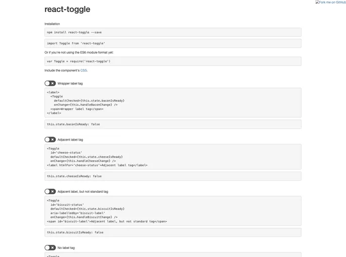
Overview
The elegant toggle component for React brings a modern and user-friendly approach to controlling state within your applications. This component functions as a glorified checkbox, making it not just visually appealing, but also functional and straightforward. Whether you’re looking to implement a straightforward toggle feature or a more complex user interface, this component will surely meet your needs.
What sets this toggle apart is its flexibility and accessibility. It’s designed to help developers easily manage the state of a toggle with both controlled and uncontrolled props, integrating seamlessly into any React project.
Features
- Checked State: The
checkedprop allows the toggle to be controlled based on a boolean value, indicating whether the toggle is active or not. - Default Checked: The
defaultCheckedprop sets the initial state of the toggle on render, offering an easy way to manage default behavior. - Event Callbacks: With
onChange,onFocus, andonBlurprops, you can easily respond to user interactions, allowing for a more dynamic user experience. - Customizable Icons: The
iconsprop allows you to customize the appearance of the toggle with your own icons for checked and unchecked states, or eliminate icons altogether. - Accessibility Features: The component supports
aria-labelledbyandaria-labelprops, ensuring users with screen readers have a proper understanding of the toggle’s function. - Disabled State: Using the
disabledprop, you can easily enable or disable the toggle based on your application’s logic, providing full control over user interaction. - Lightweight and Stylish: This component not only functions well but does so with a clean design that integrates beautifully into your application’s UI.
- Easy Integration: Simply include the component’s CSS for default styling, making it straightforward to add to any project.


