 Github Stars:
 Last Commit:
  Created:
Overview
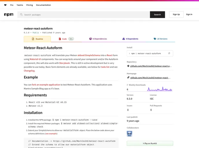
Meteor-React-Autoform is an innovative tool that enables developers to effortlessly create React forms using Material-UI components. By translating your Meteor aldeed:SimpleSchema into a functional form, this package not only streamlines development but also enhances the user interface of your applications. With basic elements already available and ongoing development, it presents itself as a highly adaptable solution for those in need of quick form functionalities.
One of the standout benefits of Meteor-React-Autoform is its compatibility with testing libraries and Storybook, allowing for easy integration and validation of forms in various environments. Whether you’re working on a personal project or a larger application, this tool offers a solid foundation for implementing complex form features with minimal hassle.
Features
- Simple Schema Integration: Easily integrates with aldeed:SimpleSchema, simplifying form creation and validation within your Meteor applications.
- Material-UI Components: Utilizes Material-UI components to provide a clean and modern design, enhancing user experience.
- Customizable Buttons: Supports custom button components, labels, and styles, allowing designers to tailor UI elements to specific needs.
- Debug Mode: Includes a debug option to output form data to the console when submitting, helpful for troubleshooting and development.
- Error Handling: Handles form submission errors efficiently, with customizable error styles and titles for improved user feedback.
- Flexible Themes: Offers the ability to select or provide your own Material-UI theme, ensuring your forms align with your overall application design.
- Active Development: Continually being improved, with a roadmap for future features and enhancements, keeping the tool relevant and up-to-date.


