 Github Stars:
 Last Commit:
  Created:
Overview
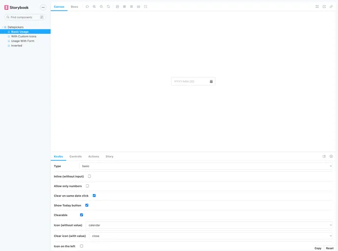
If you’re a fan of React and Semantic UI, you’re probably aware that a robust datepicker isn’t part of the core library. That’s where the react-semantic-ui-datepickers come into play. This library fills that gap, offering a flexible datepicker solution that blends seamlessly with the Semantic UI design system. Whether you need a simple date input or a more advanced range selection, this component aims to meet those needs with style.
The datepicker supports various props from both Form.Input and Dayzed components, making it a versatile choice for developers looking to enhance their forms. With a focus on usability and customization, this datepicker not only looks great but also provides essential functionality for any application that requires date selection.
Features
Integration with Semantic UI: Designed to complement the Semantic UI aesthetics, ensuring a cohesive look and feel in your applications.
Basic and Range Datepicker Options: Flexibly choose between a single date selection or a range of dates, catering to different user needs.
Customizable Props: Supports many props from Form.Input and Dayzed, allowing for extensive customization to fit your specific use case.
Numeric Input Support: With an option to allow only numeric inputs, it ensures that users enter valid date formats.
Clearable Inputs: Users can effortlessly clear their selections, providing a better user experience when correcting date inputs.
AutoComplete Feature: Comes with an autocomplete option to enhance user efficiency, making form-filling quicker and smoother.
Icon Customization: Choose from various icons from semantic-ui-react, or use your custom icons for clear actions, adding a personal touch to your design.
State Reset Control: The ability to control the state reset when the same date is clicked allows for more intuitive interactions in date selection processes.


