 Github Stars:
 Last Commit:
  Created:
Overview
The React UI Components is a collection of lightweight and reusable UI components for web applications built on React. The main goal of this library is to provide developers with a wide range of useful components that can be easily integrated into their projects.
Features
- Lightweight: The UI components in this library are designed to have a minimal impact on performance and resource usage.
- Reusable: Each component is built to be highly reusable, allowing developers to easily incorporate them into different parts of their applications.
- Compatible with Create React App: The components are compatible with apps created using Create React App (CRA), making it easy to integrate them into existing projects.
- Storybook Integration: The library provides integration with Storybook, allowing developers to explore and interact with the components in a isolated environment.
Installation
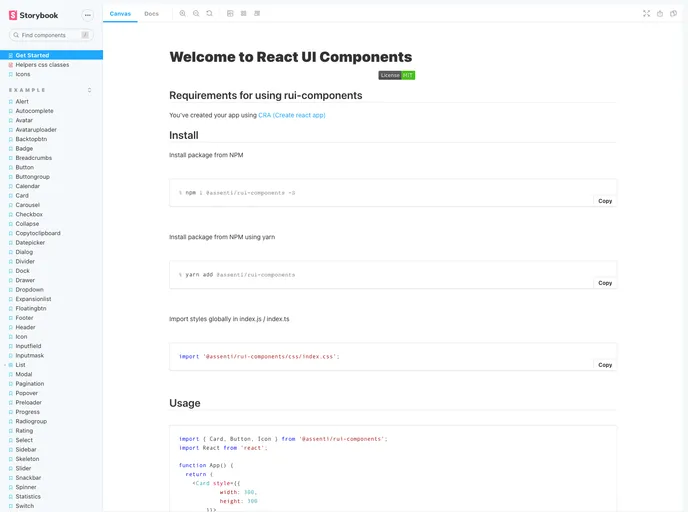
To install the React UI Components, follow these steps:
- Open your project’s terminal.
- Run the following command to install the library:
npm install rui-components
- Import the components in your
index.jsorindex.tsfile:
import { ComponentName } from 'rui-components';
- Use the components in your
App.jsorApp.tsxfile:
<ComponentName />
Summary
The React UI Components library offers a collection of lightweight and reusable UI components that are compatible with Create React App. With features such as high reusability and integration with Storybook, it provides developers with a convenient way to enhance the user interface of their web applications.


