 Github Stars:
 Last Commit:
  Created:
Overview
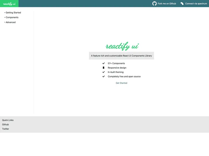
The reactify-ui is a feature-rich and customizable React UI Components Library. It provides a wide range of components that can be easily used and customized within your React applications. The library is currently in alpha version.
Features
Component Composition: Most of the components in reactify-ui are built to accept other components as children, allowing you to create powerful and interesting component compositions. These components act as containers and can have default behaviors or advanced use cases.
Theming Support: The reactify-ui library includes inbuilt support for theming. You can easily customize the look and feel of the components by using the theming section in the documentation.
Easy Styling: Styling the components is made easy with reactify-ui. You can pass a className or use the styles prop to apply custom styles. Additionally, most components have BEM class names which can be used for targeting specific elements.
Extensive Components List: The reactify-ui library comes with a wide range of components that are included by default. Some of the components available are Button, Label, Toggle Switch, Radio Input, Alert, Checkbox, Full Screen, and many more.
Installation
To install reactify-ui library, run the following command in your terminal:
npm i reactify-ui
Summary
The reactify-ui is a powerful and customizable React UI Components Library. It provides a wide range of components with features like component composition, theming support, easy styling, and an extensive components list. You can easily install the library using npm and start using the components in your React applications.


