 Github Stars:
 Last Commit:
  Created:
Overview
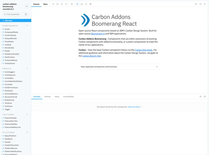
The Carbon Addons Boomerang React Netlify Status is a library of addon components for Boomerang written in React. It provides additional functionality and features to enhance the Boomerang framework. This library is built on top of Carbon and integrates seamlessly with it. It also supports the use of Carbon themes, allowing users to easily customize the appearance of the components.
Features
- React components for Boomerang: The library provides a collection of React components that can be used with Boomerang, extending its functionality.
- Integration with Carbon: The components are built on top of Carbon, ensuring a consistent design and user experience.
- Support for Carbon themes: Users can easily customize the appearance of the components by using Carbon theme functionality and CSS custom properties.
Installation
To install the Carbon Addons Boomerang React Netlify Status library, follow these steps:
Install the addons package, carbon, and all of the required peer-dependencies using your preferred package manager (e.g., pnpm, npm, yarn).
pnpm install carbon-addons-boomerang-react-netlify-statusEnsure that you have Sass installed and configured for your bundler. The components rely on Sass and import the entry style sheet for the components.
// Import the styles in your JavaScript code
import 'carbon-addons-boomerang-react-netlify-status/styles.scss';
If you want to use Carbon themes, import the desired theme and configure your styles to use the associated CSS custom properties.
// Import the default theme
import 'carbon-addons-boomerang-react-netlify-status/themes/default.scss';

// Import the Gray 10 theme
import 'carbon-addons-boomerang-react-netlify-status/themes/gray10.scss';

// Use Carbon theme tokens in your styles
// Example: Changing font hosting to Akamai instead of self-hosting
$use-akamai-cdn: true;
import '@carbon/react';
If you want to use the Boomerang theme, set the data-carbon-theme attribute value to “boomerang” in your app.
<html data-carbon-theme="boomerang">
  <!-- Your app code -->
</html>
Import and use the desired components in your application.
Summary
The Carbon Addons Boomerang React Netlify Status library provides addon components for Boomerang written in React. It integrates seamlessly with the Carbon framework, ensuring a consistent design and user experience. Users can easily customize the appearance of the components by utilizing Carbon theme functionality and CSS custom properties. Installation is straightforward and requires importing the necessary styles and setting the appropriate attributes in your app. With this library, developers can enhance their Boomerang applications with additional features and functionality.


