 Github Stars:
 Last Commit:
  Created:
Overview:
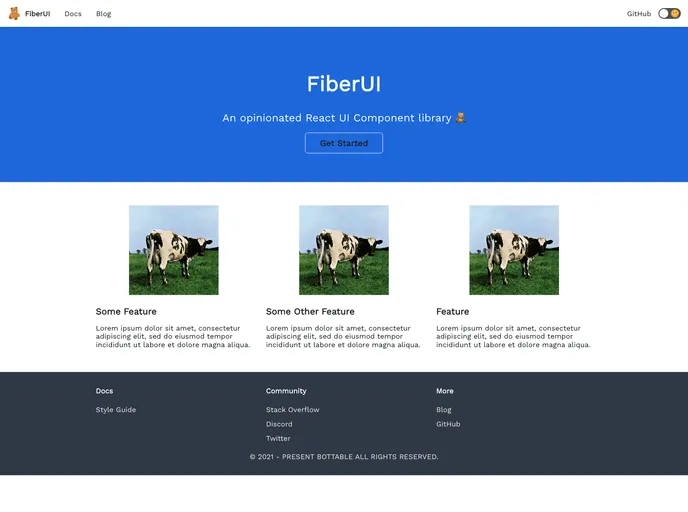
FiberUI is an opinionated React UI Component library that provides a set of reusable and customizable components for building user interfaces in React applications. It follows the NPM JavaScript Style Guide and aims to save development time and effort by offering a collection of pre-built components that adhere to best practices.
Features:
- Reusable components: FiberUI provides a wide range of reusable components such as buttons, inputs, modals, and more, that can be easily integrated into React projects.
- Customizability: The library allows developers to easily customize the appearance and behavior of the components to fit the specific design needs of their application.
- UIProvider: FiberUI provides a UIProvider component that can be used to wrap the entire React project, enabling access to the library’s components and features.
Installation:
- Install the package using npm or yarn:
npm install fiber-ui
or
yarn add fiber-ui
- Install peer dependencies:
npm install react react-dom prop-types
or
yarn add react react-dom prop-types
- Load the Works Sans font:
Add the following code to the
<head>section of your HTML file:
<link rel="stylesheet" href="https://fonts.googleapis.com/css?family=Work+Sans:400,700&display=swap">
Alternatively, you can download the typeface-work-sans package and add the following line to your project’s entry file:
require('typeface-work-sans');
Summary:
FiberUI is a React UI Component library that offers reusable and customizable components for building user interfaces in React applications. It follows the NPM JavaScript Style Guide and provides a UIProvider component for easy integration. Installation involves installing the package, its peer dependencies, and loading the Works Sans font.


