 Github Stars:
 Last Commit:
  Created:
Overview
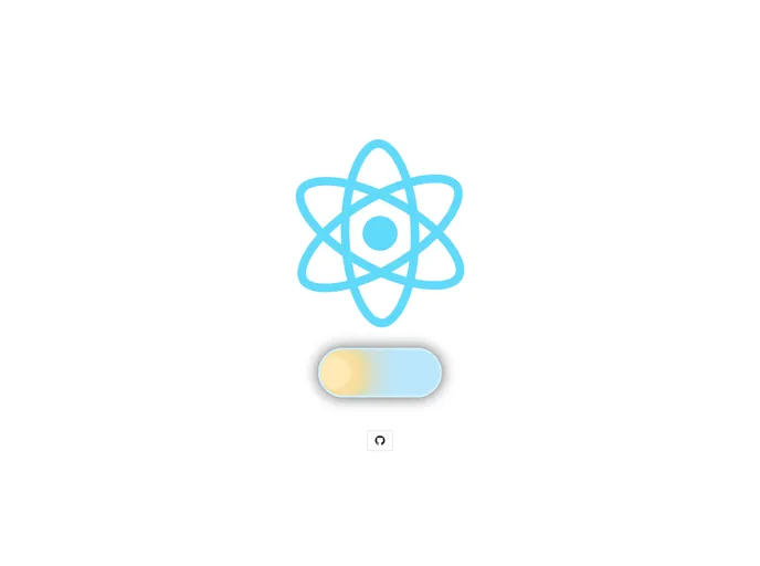
The react-day-and-night-toggle is a sleek and engaging component designed for React applications, allowing users to effortlessly switch between light and dark themes. Its eye-catching animations enhance user experience, making theme toggling not just functional but visually appealing. With a straightforward setup and customizable options, this toggle is perfect for developers looking to add a modern touch to their applications.
Features
- Easy Installation: Quickly set up the component using npm or yarn, getting you started without hassle.
- Customizable Size: Adjust the toggle button’s size to match your design requirements with an even integer for optimal results.
- State Management: Utilize the
onChangeprop to manage the toggle state reliably within your application. - Loading State: The
startInactiveoption prevents users from switching themes right after loading, ensuring a smoother transition to your site’s styles. - Animation Control: With the
animationInactiveprop, control how the toggle behaves during its animation phase, enhancing usability. - Dynamic Shadows: The button features adaptive shadows that change based on the theme, providing a refined visual effect between day and night modes.
- Custom Class Names: Apply your own styles easily using the
classNameprop for tailored looks.
This component combines ease of use with delightful design elements, making it an excellent addition to any React application.


