 Github Stars:
 Last Commit:
  Created:
Overview
If you’re on the lookout for a responsive UI library for React, then you might want to check out the React Responsive UI components. Designed to work seamlessly with React version 16.3 and above, this library aims to provide a comprehensive toolkit of components tailored for both mobile and desktop environments. After some challenges faced on GitHub, the library has made its way to GitLab, reflecting its resilience and commitment to supporting developers in building dynamic applications.
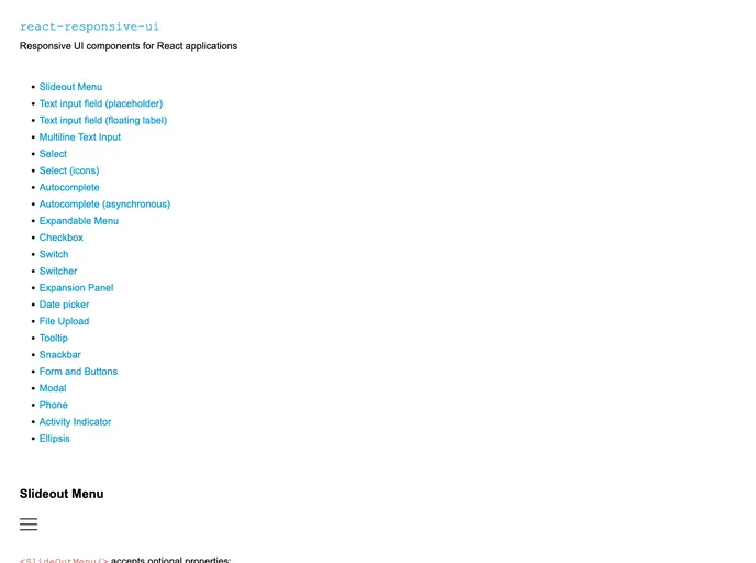
This library prioritizes ease of use, featuring a wide array of components, extensive documentation, and a demo page that showcases its functionalities. Whether you’re building a simple form or a complex UI, the React Responsive UI components offer the flexibility and responsiveness needed for modern web applications.
Features
Responsive Design: The components are designed with responsiveness in mind, making them adapt seamlessly to various screen sizes, including mobile devices.
Customizable Styles: With native CSS variables, developers have the ability to easily customize the styles, allowing for consistent theming and design options across applications.
Error Handling in Forms: Each form component supports an error property that can display validation messages and style fields as “invalid,” enhancing user experience when dealing with forms.
Small Screen Optimization: The library includes specific styles for mobile devices, ensuring components like Select and Autocomplete are user-friendly on smaller screens.
Browser Compatibility: It has been tested across major browsers such as Chrome, Firefox, Safari, and even IE 11, with fallback solutions for older browsers.
Tree-Shaking Support: For those using modern build systems, the library supports tree-shaking, allowing developers to import only the necessary components and styles, effectively reducing the final bundle size.
Comprehensive Demo Page: A demo page provides code examples for every component, which is invaluable for learning and understanding how to implement the library in various scenarios.
Support for Required Fields: Easily manage form validation with asterisks on required fields, ensuring clarity and accessibility for users filling out forms.


