 Github Stars:
 Last Commit:
  Created:
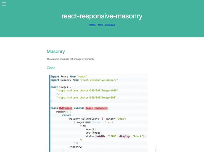
Overview
React-responsive-masonry is an innovative and lightweight component designed specifically for building responsive masonry layouts in React applications. Utilizing CSS flexbox, this package offers a seamless way to create dynamic grid structures that automatically adjust based on screen size. Whether you’re building a gallery, portfolio, or any other layout requiring a flexible and beautiful use of space, this package simplifies the process while ensuring a polished end result.
Installation is straightforward, making it accessible for developers at all levels. With the ability to create layouts that elegantly resize and adapt, the react-responsive-masonry package is a delightful addition to any React project.
Features
- Responsive Layouts: Automatically adjusts the number of columns based on the screen size, ensuring your content always fits perfectly.
- Easy Installation: Available via NPM or Yarn for quick setup, or can be included directly from a CDN if preferred.
- Custom Gutter Settings: You can define the margin surrounding each item, allowing for a tailored visual experience.
- Flexible Component Props: Offers various props like className and style for custom styling of the container and items.
- Breakpoints for Columns and Gutter: Includes options to set different columns and gutter sizes for specific breakpoints, enhancing responsive design further.
- Minimalistic: Built with a focus on simplicity and performance, the component retains a small footprint in your app.
- Open for Contributions: Actively encourages community involvement for bugs or new features, promoting continuous improvement.


