 Github Stars:
 Last Commit:
  Created:
Overview
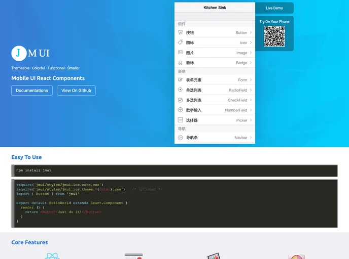
The Mobile UI React Components are designed specifically with mobile usage in mind, providing a sleek and modern interface for developers who want to create high-quality applications. With an enterprise-class design language, this library is based on the popular Framework7, offering a versatile collection of components that cater to both iOS and Material themes.
Whether you’re developing a simple application or a complex mobile site, this library provides the essential components needed to enhance user experience. From forms and notifications to various navigation elements, the robust set of features supports a seamless development process.
Features
- Enterprise-Class Design: Delivers a high-quality UI style that meets the needs of professional developers.
- Mobile-Optimized: Specifically designed for mobile interfaces, ensuring excellent performance and usability on handheld devices.
- Theming Options: Offers iOS and Material themes, allowing developers to choose styles that match their app’s design.
- Rich Component Library: Includes various UI components such as grids, lists, modals, notifications, and more to cover all common requirements.
- Easy Installation: Simple setup requiring Node, npm, and React ensures quick integration into any project.
- Customizable Color Schemas: Provides a range of color options including black, gray, blue, and more to suit unique branding needs.
- Active Community Contribution: Encourages contributions from developers, fostering a collaborative environment for improving the library.
- Comprehensive Documentation: Offers resources to help developers understand installation, usage, and available components effectively.


