 Github Stars:
 Last Commit:
  Created:
Product Analysis: Minerva UI
Overview
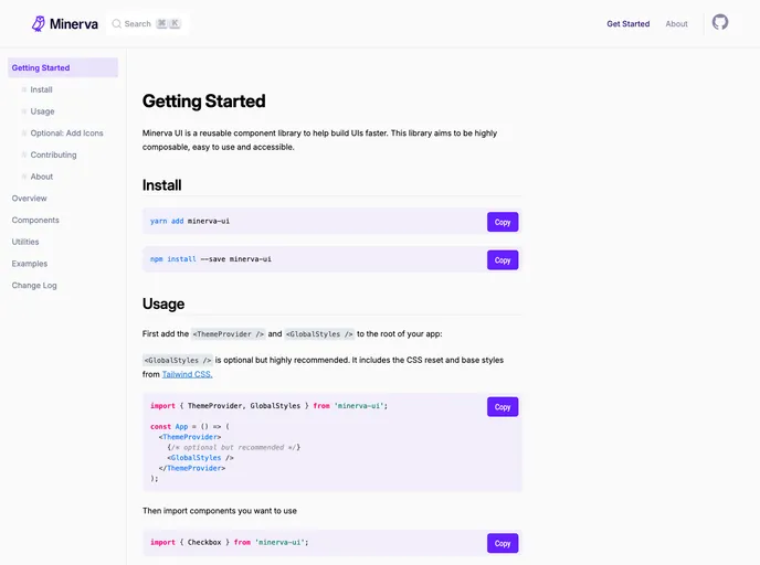
Minerva UI is a reusable component library designed to assist in building user interfaces more efficiently. This library focuses on providing highly composable, declarative, and accessible components. With an emphasis on customization and utility props, Minerva UI aims to streamline the UI development process.
Features
- Highly Composable: Minerva UI offers a wide range of components that can be easily combined to create complex UI layouts.
- Easy to Customize: With Utility Props, Minerva UI allows for quick and convenient styling of components. These utility props are inspired by Tailwind CSS, providing a familiar and flexible styling experience.
- Influences: Minerva UI draws inspiration from Ryan Florence’s “Reach UI” Guidelines, offering guidelines for creating composable and declarative React APIs. Additionally, it takes notes from the utility-based CSS framework Tailwind CSS and the batteries-included React Component library Chakra UI.
Installation
To install Minerva UI, you can use either npm or yarn. Use the following commands:
npm install --save minerva-ui
or
yarn add minerva-ui
After installing, you need to add the <ThemeProvider /> and <GlobalStyles /> components to the root of your application. The <GlobalStyles /> component is optional but recommended as it includes the CSS reset and styles from Tailwind CSS.
Next, you can import the desired components into your UI and start using them in your app.
Summary
Minerva UI is a reusable component library aimed at accelerating UI development. With its highly composable and customizable components, developers can easily create complex and accessible user interfaces. The library takes inspiration from various tools and frameworks to provide a seamless and efficient development experience.


