 Github Stars:
 Last Commit:
  Created:
Overview:
The @culturehq/components is a component library developed by CultureHQ. It provides a set of reusable components that can be easily integrated into web projects. The library offers a range of features and provides a convenient way to import and use its components.
Features:
- Reusable Components: The @culturehq/components library provides a wide range of reusable components that can be easily imported and used in web projects.
- Separate named exports: All the components in the library can be imported as separate named exports, providing flexibility in using only the required components.
- Styles integration: To get the styles of the components, users need to import the ‘@culturehq/components/dist/main.css’ stylesheet into their own stylesheet.
Installation:
To install and use the @culturehq/components library, follow the steps below:
- Ensure that you have Node.js and Yarn installed on your system.
- Run the following command in the root of your project’s repository to install the dependencies:
yarn
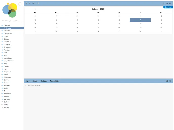
- Once the dependencies are installed, start the Storybook server by running the following command:
yarn start
- You can now view the output at http://localhost:6006.
Summary:
The @culturehq/components library provides a set of reusable components that can be easily integrated into web projects. It offers separate named exports for each component and requires the integration of the main CSS file to apply the component styles. To use the library, users need to have Node.js and Yarn installed on their system and follow the installation steps provided. The library is open source and available under the MIT License.


