


 Github Stars:
 Last Commit:
  Created: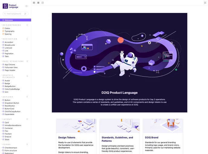
Overview:
UI Kit is a collaboration between D2iQ’s product design team and engineering team. It provides tools for engineers to build applications that follow the standards and guidelines of the Design System.
Features:
- Components: A collection of pre-built UI components that follow the Design System guidelines.
- Design Tokens: Consistent set of colors, typography, spacing, etc. that can be used across the application.
- Icon Library: A library of icons that can be used in the application.
- Design Guidelines: Guidelines for designing and building UI applications that align with the Design System.
Installation:
To install the UI Kit, follow these steps:
- Install dependencies:
npm install
- Start the Storybook server locally by running the following command:
npm run start
- Visit http://localhost:6006/ to access the Storybook server.
Summary:
UI Kit is a collaboration between D2iQ’s product design team and engineering team. It provides a collection of pre-built UI components, design tokens, an icon library, and design guidelines. The UI Kit helps engineers build applications that adhere to the standards and guidelines of the Design System. Installation of the UI Kit involves installing dependencies and starting the Storybook server locally.


