 Github Stars:
 Last Commit:
  Created:
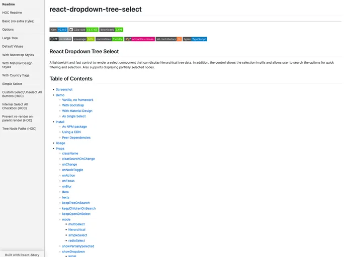
Overview
React Dropdown Tree Select is a versatile and efficient component designed for rendering a selection interface that can handle hierarchical tree data. Its lightweight structure ensures a seamless user experience, making it easy to navigate through multiple layers of options. This component not only displays selections in a visually appealing way through the use of pills but also enables quick filtering of choices, aligning with modern user expectations for interactive elements.
With features that support partial node selections and a robust search functionality, React Dropdown Tree Select stands out as an ideal choice for developers looking to implement a user-friendly selection mechanism. This component is compatible with various frameworks and styling methods, ensuring flexibility across different project requirements.
Features
- Lightweight and Fast: Built for efficiency, this component ensures smooth performance even with extensive hierarchical data.
- Hierarchical Tree Data Support: Effectively displays data in a tree format, allowing users to intuitively navigate through multiple levels of options.
- Selection in Pills: Shows selected options in a clean pill format, improving the overall interface and user interaction.
- Search Functionality: Users can quickly filter and search through options, facilitating a streamlined selection process.
- Support for Partially Selected Nodes: Allows users to select nodes while still showing which items under those nodes are selected, providing clarity in multi-level selections.
- Customizable Styling: Easily customizable with default styles, Bootstrap, or Material Design, enabling developers to match the component with their application’s design aesthetics.
- Keyboard Navigation: Provides efficient keyboard controls to enhance accessibility and usability for all users.
- Performance Optimizations: Includes search debouncing and virtual rendering to minimize DOM manipulations and enhance the overall performance of the component.


