 Github Stars:
 Last Commit:
  Created:
Overview
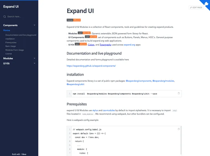
Expand UI & Modules is a collection of React components, tools, and guidelines for creating expandable products. It includes modules for dynamic extensible JSON powered forms, a set of UI components for buttons, panels, menus, and higher-order components (HOCs), as well as a UI kit with predefined colors and typography. The library also provides detailed documentation and a live playground.
Features
- Modules: Dynamic extensible JSON powered form library for React
- UI Components: Set of components such as buttons, panels, menus, and HOCs. Used to build expandable web applications.
- UI Kit: Contains colors and typography used across expandable.org apps
Installation
To install the Expand UI & Modules theme and its dependencies, follow these steps:
Step 1: Ensure you have the required prerequisites. Expand UI & Modules uses Stylus and CSS modules by default to import stylesheets. It is necessary to import .styl files located in the node_modules folder. We recommend using webpack, but other bundlers can be configured.
Step 2: Add the Expand UI & Modules theme to your project by installing the following npm packages:
@expandorg/components@expandorg/modules@expandorg/uikit
Step 3: Configure your project’s webpack (or other bundler) to import the necessary .styl files from the node_modules folder.
Here is an example of a basic webpack configuration:
module: {
  rules: [
    {
      test: /\.styl$/,
      include: /node_modules/,
      use: [
        'style-loader',
        'css-loader',
        'stylus-loader'
      ]
    }
  ]
}
Summary
Expand UI & Modules is a collection of React components, tools, and guidelines for creating expandable products. It includes modules for dynamic extensible JSON-powered forms, a set of UI components for buttons, panels, menus, and higher-order components (HOCs), as well as a UI kit with predefined colors and typography. The theme provides detailed documentation and a live playground for developers. It is licensed under the Mozilla Public License 2.0.


