 Github Stars:
 Last Commit:
  Created:
Overview
Hack Oregon’s React Component Library version 0.2.5 is an innovative tool aimed at providing consistent, reusable components for various projects. Still in development, this library seeks to unify platform components along with a comprehensive style guide and data visualization elements. By utilizing CSS Modules, it adopts a modern approach to styling that promises to facilitate cross-project compatibility.
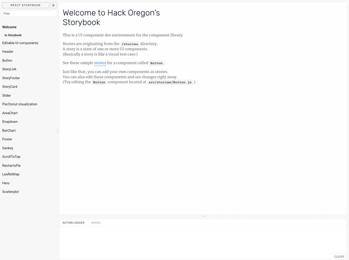
The library is primarily built using React Storybook, which allows developers to create and maintain components in an interactive environment. Its collaborative nature, evident in the clear guidelines for contributions, underscores a community-driven approach to building robust resources for developers.
Features
- Cross-Project Compatibility: Components are designed to be reusable across various projects, enhancing productivity and consistency.
- Integrated Style Guide: A comprehensive style guide accompanies the components, aiding developers in adhering to best practices for design and styling.
- Built with React Storybook: The use of React Storybook enables easy development and management of components and provides interactive examples for better understanding.
- Modular CSS Styling: Utilizing CSS Modules ensures that styles are scoped locally, preventing clashes and easing debugging.
- Development Environment Setup: Easy to set up with Node Version Manager (NVM) and yarn, streamlining the installation process.
- Hot Module Replacement: The development environment supports hot module replacement, allowing developers to see changes in real time without a full reload.
- Comprehensive Documentation: Documentation, along with visual examples for each component, will be readily available, helping users to get started quickly.
- Active Community Contribution: The project encourages contributions from developers, with clear guidelines for adding features and fixing issues, fostering a collaborative ecosystem.


