 Github Stars:
 Last Commit:
  Created:
Overview
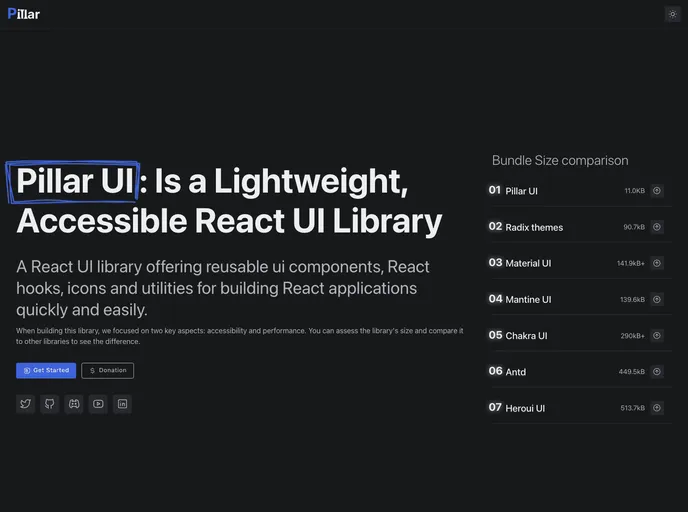
Pillar-ui is a modern design system built with React, aimed at providing a comprehensive set of reusable UI components. With a focus on accessibility, modularity, consistency, and responsiveness, Pillar-ui aims to facilitate the development of modern web applications. It also offers theming capabilities, a customizable icon component, a set of hooks for common UI interactions, and flexibility through the use of variants.
Features
- Accessibility: All components adhere to the latest WCAG 2.1 guidelines, supporting high contrast mode and prefer-reduced-motion.
- Modularity: Components are designed to be modular and easy to customize and extend. They can be used individually or combined to build complex user interfaces.
- Consistency: A consistent visual language and naming conventions are used across components, making them easier to learn and use.
- Responsive: Components are designed to work across a range of devices and screen sizes, ensuring a consistent user experience.
- Theming: Components can be easily customized to match brand or application requirements.
- Icon Component: Pillar-ui includes a customizable icon component with a variety of pre-built icons available.
- Hooks: A set of hooks is provided to simplify the implementation of common UI interactions, such as toggling a menu.
- Usability: Pillar-ui follows UX principles and guidelines, providing a consistent and intuitive user experience.
- Flexibility: Components support variants, enabling greater customization and flexibility.
Installation
To install Pillar-ui, follow these steps:
- Choose the package you need - core, hooks, or icons.
- Run the following command to install the chosen package:
npm install @pillar-ui/{package-name}
- Import the desired components and use them in your React application.
Summary
Pillar-ui is a modern React design system that offers a comprehensive set of reusable UI components. Its focus on accessibility, modularity, consistency, and responsiveness makes it a valuable tool for developers creating modern web applications. With additional features such as theming, a customizable icon component, hooks for common UI interactions, and flexibility through variants, Pillar-ui provides developers with a powerful and user-friendly design system.


