 Github Stars:
 Last Commit:
  Created:
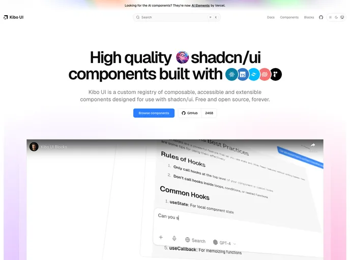
Overview:
Kibo UI is a custom registry of composable, accessible, and open-source components specifically designed to work with shadcn/ui. These components use CSS variables from shadcn/ui and are intended to seamlessly integrate with existing primitives. Kibo UI serves as a collection of building blocks that allow developers to create more complex components efficiently, aiming to reduce boilerplate code while maintaining flexibility and responsive design.
Features:
- Composable: Components are designed as building blocks that can be combined to create complex interfaces.
- Accessible: Prioritizes accessibility to ensure that user interfaces are usable by a diverse audience.
- Open Source: Licensed as open source, allowing for customization and community contributions.
- Seamless Integration: Works neatly with existing shadcn/ui primitives, reducing compatibility issues.
Installation:
To install Kibo UI, you can follow these steps:
- Clone the repository from [repository URL].
- Navigate to the project directory using the terminal.
- Install the necessary dependencies by running
npm install. - Import the desired components into your project.
- Start integrating Kibo UI components into your application.
Summary:
Kibo UI is a valuable resource for developers looking to streamline the process of building complex interfaces. By providing a comprehensive library of accessible and composable components that seamlessly integrate with shadcn/ui, Kibo UI simplifies the development process while maintaining flexibility and responsiveness. With its open-source nature, Kibo UI encourages collaboration and customization within the development community.


