 Github Stars:
 Last Commit:
  Created:
Overview
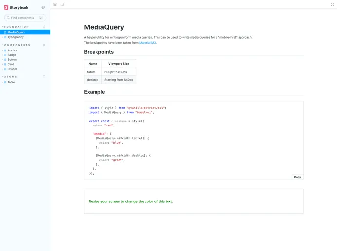
Hazel UI is a flexible React component library designed to allow maximum customization and speed of development. It provides a wide range of web elements that can be easily built according to your specific needs.
Features
- Flexible React component library: Hazel UI provides a comprehensive collection of React components that can be customized to suit your requirements.
- Maximum customization: The library allows developers to customize and style the components to match their desired design and functionality.
- Fast development: With Hazel UI, you can quickly build web elements and applications without spending excessive time on development.
Installation
To install Hazel UI in your project, follow these steps:
- Open your project’s root level component.
- Add the following line of code to import Hazel UI:
import { HazelUI } from 'hazel-ui';
- Initialize the Hazel UI components as needed in your project.
Summary
Hazel UI is a flexible and customizable React component library that enables developers to quickly build web elements. With its wide range of components and maximum customization options, Hazel UI offers a fast and efficient way to develop web applications.


