 Github Stars:
 Last Commit:
  Created:
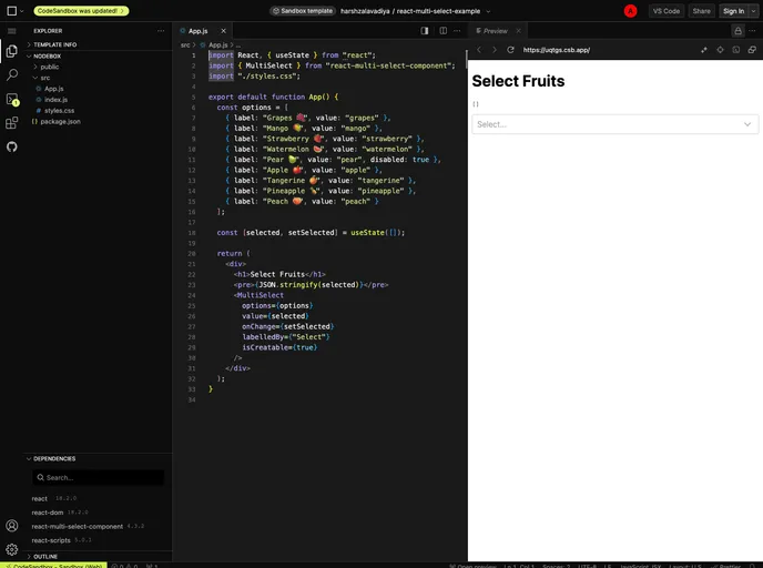
Overview
The react-multi-select-component is a versatile and user-friendly dropdown solution designed for applications that require multiple selection capabilities. This component stands out due to its simplicity and lightweight nature, making it an ideal choice for developers looking to enhance user interfaces without compromising performance. With features such as checkboxes, a search function, and a select-all functionality, it offers an intuitive experience for users navigating through long lists of options.
Built with TypeScript, this component not only guarantees type safety but also ensures that it can be easily integrated and customized within various projects. The emphasis on theming allows developers to match the dropdown’s appearance seamlessly with their application’s aesthetics, providing a cohesive user experience.
Features
- Zero Dependency: This component does not rely on external libraries, ensuring easy integration into your project without additional overhead.
- Lightweight (<5KB): Its compact size helps maintain optimal performance in your application, reducing load times.
- Themeable: Customize the look and feel of the dropdown to align with your brand, enhancing the overall user interface.
- Written with TypeScript: Enjoy the benefits of type safety, making your code more robust and maintainable.
- Select All Option: Easily toggle the ‘Select All’ feature for quick selection of multiple options, streamlining the user’s workflow.
- Loading Spinner: Display a spinner during data fetching, providing users with visual feedback that their action is being processed.
- Custom Filtering: Implement personalized filtering options for a tailored selection process, even accommodating asynchronous data sources.
- Localization Support: Leverage the
overrideStringsproperty to adapt the dropdown to various languages or specific corporate terminologies.


