 Github Stars:
 Last Commit:
  Created:
Overview
Enchanted React Components is a robust library that brings a suite of UI components specifically designed for HCL Software products. Built on top of the popular Material UI Component Library, this collection not only enhances user experience with its visually appealing elements but also ensures ease of integration into any React project. With its focus on modularity and flexibility, developers can create complex interfaces with simplicity and efficiency.
The structure of the library is well-organized, providing atomic, composite, and prerequisite components that make it easier to build and maintain applications. In addition to a solid base of components, Enchanted React Components emphasizes theming and RTL support, catering to diverse user needs.
Features
Atomic Components: These are the smallest building blocks, such as Buttons and Panels, which can be combined to create more complex components.
Composite Components: Formed from atomic components, these elements help create larger, more functional pieces like specific Forms.
Theming Support: Comes with LightNeutralGrey and LightCoolGrey themes, with plans for additional Dark themes, allowing for a personalized UI experience.
RTL Support: Fully supports right-to-left languages, ensuring accessibility for diverse users worldwide.
Modular Exports: Each component folder includes an index.ts file for streamlined local and global exports, enhancing code readability and maintainability.
Development Utilities: Offers a comprehensive set of NPM commands for installation, building, linting, and testing, facilitating a smooth development workflow.
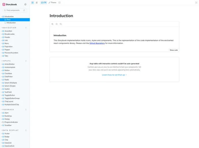
Built-in Storybook: Allows for easy visualization and testing of components, making it simpler for developers to showcase UI elements during development.
Strict Dependency Management: Employs version control for important dependencies to ensure stability and consistent performance across projects.


