 Github Stars:
 Last Commit:
  Created:
Overview
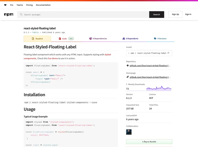
The React-Styled-Floating-Label is a dynamic component designed to enhance user input experiences with HTML forms. This component integrates a floating label directly with any standard HTML input, facilitating a clean and intuitive interface that enhances accessibility and usability. Built to work seamlessly with styled-components, this floating label component allows for easy customization and integration into existing projects without significant overhead.
This versatile component serves as both a label and placeholder, encouraging better form handling while maintaining aesthetic appeal. Whether you’re developing a simple form or a complex web application, the React-Styled-Floating-Label offers a streamlined solution for input styling and management.
Features
- Easy Installation: Quickly integrate the component into your project with a simple npm command:
npm i react-styled-floating-label styled-components --save. - Customizable Styles: Supports styling with styled-components, allowing developers to apply custom styles effortlessly.
- Flexible API Options: Various props are provided, such as
textfor label text andstylefor custom label styles, enhancing versatility. - Advanced Placeholder Styling: Customize placeholder styles using standard CSS properties with the
--placeholder-prefix for a unique look and feel. - Custom Positioning: Offers options for custom positioning of the floating label, ensuring it fits perfectly within any form layout.
- Container Customization: Allows the use of different HTML elements for the component container, providing better integration with different contexts.
- Demo Availability: Easily visualize the component in action through provided demo options, making it easy to see customization possibilities.


