Overview:
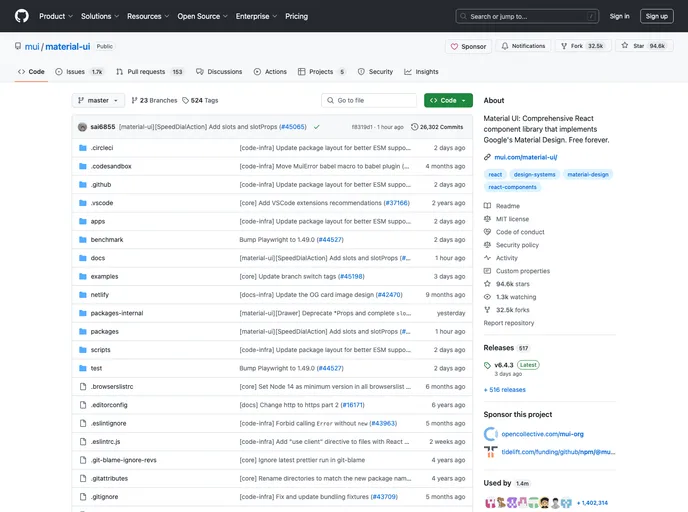
The Reason bindings for Material-UI is a work-in-progress library that provides bindings for using Material-UI components in Reason/OCaml applications. It is not fully supported yet, but users are encouraged to create issues or pull requests if they notice any missing features.
Features:
- AppBar: Provides a header for the application.
- Avatar: Displays a user’s profile picture or icon.
- Badge: Adds a badge or notification count to another component.
- BottomNavigation: Represents a bottom navigation bar.
- ButtonBase: A base component for button-like elements.
- Button: Displays a button component.
- CardActions: Contains actions for a Card component.
- CardContent: Displays the main content of a Card.
- CardHeader: Displays a header for a Card component.
- CardMedia: Displays media, such as an image, within a Card.
- Card: Represents a Card component.
- Checkbox: Represents a checkbox input.
- Chip: Displays a chip or tag component.
- CircularProgress: Displays a circular progress indicator.
- Collapse: Provides a collapse/expand transition effect.
- DialogActions: Contains actions for a Dialog component.
- DialogContentText: Displays text content within a Dialog component.
- DialogContent: Displays content within a Dialog component.
- DialogTitle: Displays a title for a Dialog component.
- Dialog: Represents a dialog component.
- Divider: Displays a horizontal line to visually separate content.
- Drawer: Represents a navigation drawer component.
- Fade: Provides a fade-in/fade-out transition effect.
- FormControlLabel: Represents a label for a form control component.
- FormControl: Represents a form control component.
- FormGroup: Represents a group of related form controls.
- FormHelperText: Displays helper text for a form control component.
- FormLabel: Represents a label for a form control component.
- GridList: Displays a grid list layout.
- Grid: Represents a grid layout.
- Grow: Provides a grow-in/grow-out transition effect.
- Hidden: Hides or shows components based on the screen size.
- IconButton: Displays an icon button component.
- Icon: Represents an icon component.
- InputAdornment: Displays an adornment for an input component.
- InputLabel: Represents a label for an input component.
- Input: Represents an input component.
- LinearProgress: Displays a linear progress indicator.
- ListItemAvatar: Represents an avatar within a ListItem component.
- ListItemIcon: Represents an icon within a ListItem component.
- ListItemSecondaryAction: Represents a secondary action within a ListItem component.
- ListItemText: Represents the main content within a ListItem component.
- ListItem: Represents a list item component.
- ListSubheader: Represents a subheader within a List component.
- List: Represents a list component.
- MenuItem: Represents an item within a menu component.
- MenuList: Represents a list of menu items.
- Menu: Represents a menu component.
- MobileStepper: Represents a mobile stepper component.
- MuiThemeProvider: Provides a theme to the Material-UI components.
- Paper: Represents a paper component.
- Popover: Represents a popover component.
- RadioGroup: Represents a group of radio button inputs.
- Radio: Represents a radio button input.
- Select: Represents a select dropdown component.
- Slide: Provides a slide-in/slide-out transition effect.
- SnackbarContent: Represents the content of a snackbar component.
- Snackbar: Represents a snackbar component.
- SvgIcon: Represents an SVG icon component.
- Switch: Represents a switch component.
- Tab: Represents a tab component.
- TableBody: Represents the body of a table component.
- TableCell: Represents a cell within a table component.
- TableFooter: Represents the footer of a table component.
- TableHead: Represents the head of a table component.
- TablePagination: Represents pagination for a table component.
- TableRow: Represents a row within a table component.
- TableSortLabel: Represents a sortable column label within a table component.
- Table: Represents a table component.
- Tabs: Represents a tab bar component.
- TextField: Represents a text input component.
- Toolbar: Represents a toolbar component.
- Tooltip: Displays a tooltip component.
- Typography: Represents typographical content.
Installation:
To install the Reason bindings for Material-UI, add “bs-material-ui” to the “bs-dev-dependencies” section of your “bsconfig.json” file.
"bs-dev-dependencies": [
  "bs-material-ui"
]
Summary:
The Reason bindings for Material-UI is a library that provides bindings for using Material-UI components in Reason/OCaml applications. While it is still a work-in-progress and not all features are supported yet, users are encouraged to contribute by creating issues or pull requests for missing features. The library offers a comprehensive list of components, allowing developers to easily integrate Material-UI components into their Reason/OCaml projects.


