 Github Stars:
 Last Commit:
  Created:
Overview
The React theme switcher component is a versatile tool designed to enhance the user experience by allowing users to toggle between different themes seamlessly. With a straightforward installation process and effortless usage, this component integrates smoothly into any React application, offering a customizable solution for theming.
Whether you’re looking to create a light and dark mode or explore more creative visual styles, this component provides the flexibility needed to appeal to diverse user preferences while maintaining a clean and modern aesthetic.
Features
Easy Installation: The component can be quickly added to your React application without any complex setup processes, making it accessible even for beginners.
Body Integration: By default, the theme switcher is applied directly to the body, ensuring that the theme changes affect the entire application visually.
Pre-defined Colors: The component comes pre-configured with a set of ready-to-use color themes, allowing for immediate implementation without the need for extensive customization.
Customizable Props: You have the flexibility to pass various props to the component, enabling tailored theming options that suit your specific design needs.
User-friendly Interface: The design is intuitive, ensuring that users can easily toggle between themes, enhancing overall user satisfaction.
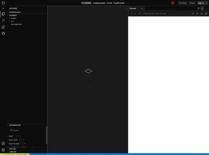
Live Demo Available: You can preview how the theme switcher works in real-time on platforms like CodeSandbox, making it easy to visualize its implementation before integrating it into your project.


