 Github Stars:
 Last Commit:
  Created:
Overview
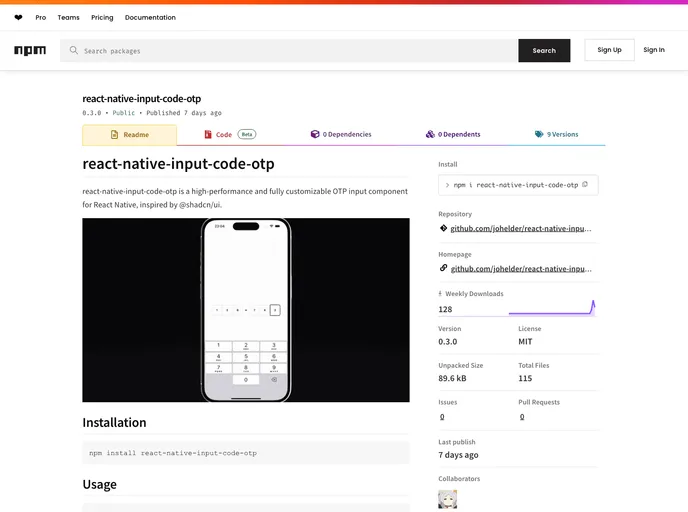
The react-native-input-code-otp is a highly efficient and customizable One-Time Password (OTP) input component designed specifically for React Native applications. It draws inspiration from the popular @shadcn/ui library and aims to deliver a seamless user experience when entering OTP codes. This versatile component adapts well to various design needs and offers developers a robust tool to enhance their applications’ security measures.
This OTP input component is perfect for developers looking to implement secure login or verification processes in their apps. With easy installation and a range of customizable features, it allows for a tailored approach to user input while maintaining high performance.
Features
- Max Length: Set the maximum number of digits for the OTP code, ensuring users enter the exact length required for secure verification.
- On Filled Callback: A callback function that triggers when the OTP input is complete, passing the entered code as a parameter for easy handling.
- Caret Color: Customize the blinking caret’s color in the input field, allowing for better visual coherence with the overall app design.
- Group Styles: Provides the option to apply custom styles to the input group, enabling unique visual presentations.
- Slot Indexing: Each input slot has a unique index required for displaying the OTP sequence, ensuring a structured response from users.
- Focused Slot Styles: Special styles can be applied when a slot is focused, enhancing user interaction and feedback during input.
- Separator Styles: Customize the appearance of separators between slots to create a visually appealing layout that aligns with your app’s design.


