 Github Stars:
 Last Commit:
  Created:
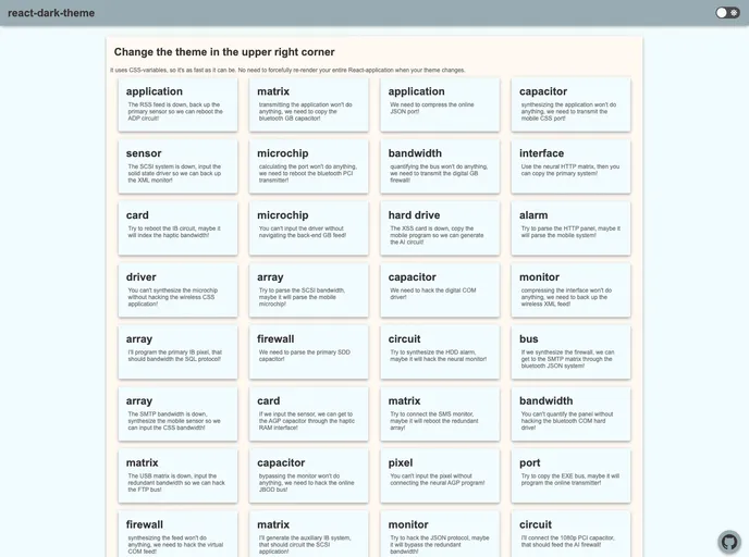
Overview
The react-dark-theme is a neat solution for those looking to implement a dark mode toggle in their applications without the overhead of full component re-renders. Utilizing CSS variables for fast styling adjustments, it provides a fluid user experience by seamlessly switching between light and dark themes. Although it seems this npm module is no longer actively maintained, it still offers valuable features for modern web development.
The implementation is designed to be straightforward, allowing developers to easily integrate it into their existing React applications. With the ability to handle themes efficiently, it ensures that your application remains visually appealing while catering to user preferences.
Features
- CSS Variables Utilization: React-dark-theme leverages CSS variables for quick styling changes, helping to avoid complete application re-renders.
- Two Theme Support: Easily switch between light and dark themes using simple object maps for variables and their corresponding values.
- Default Theme Setting: Customize the initial appearance by defining whether the dark or light theme should be the default.
- Lightweight Integration: Designed for modern browsers, it allows for a lightweight solution without the need for heavy dependencies.
- Early Loading Capability: To prevent visual glitches, it can load early in the React component lifecycle, ensuring CSS variables are set up in time.
- Flexible Class Name Assignment: The option to pass a className directly to the toggle component provides additional styling flexibility.
- Compatibility with CSS-in-JS: Works well with CSS-in-JS libraries, improving performance and theme management.


