 Github Stars:
 Last Commit:
  Created:
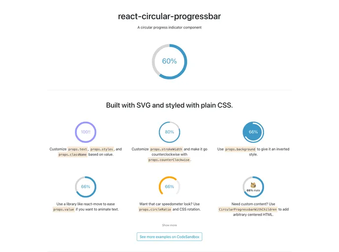
Overview
The React Circular Progressbar is an innovative and flexible component designed for developers seeking an SVG-based solution for displaying progress visually. Its new version, 2.0.0, introduces an array of enhancements that not only improve usability but also broaden customization options. Whether you’re creating dashboards or loading animations, this component can adapt to a variety of design needs.
One of the most exciting updates is the ability to incorporate arbitrary JSX within the circular progress bar, allowing for a more dynamic user interface. With the added flexibility in specifying ranges beyond traditional 0-100 values, this component can serve a wider array of applications across diverse projects.
Features
Customizable JSX: Use
CircularProgressbarWithChildrento include any JSX inside the progress bar, enhancing visual and functional versatility.Flexible Styling: The
buildStylesfunction simplifies the customization of styles, enabling you to tailor the appearance effortlessly to fit your design needs.Range Specification: Set custom
minValueandmaxValueprops to define the scale of the progress bar, making it easy to adapt to various data types.Responsive Design: The progress bar automatically adjusts to fill the width of its container, making it ideal for responsive and grid-based layouts.
Sleek Dependency Management: Easy installation through yarn or npm, making integration into projects straightforward.
Modern API: Simplified props, with the removal of outdated ones, ensure a clean interface while maintaining important functionality.
Backward Compatibility: Documentation for the previous version remains available, offering a smooth migration pathway for developers upgrading to the latest version.


