 Github Stars:
 Last Commit:
  Created:
Overview
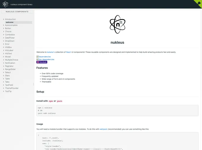
The React UI components offered by kununu are designed to facilitate the development of fast and efficient products. These reusable components are intended to be easy to implement and are constantly updated to ensure their effectiveness.
Features
- Over 80% code coverage: The components have a high level of code coverage, ensuring their reliability and reducing the likelihood of bugs.
- Frequently updated: The components are regularly updated to incorporate new features and improvements, keeping them in line with industry standards.
- Wide range of form and UI components: kununu’s collection of React UI components offers a diverse selection of form and UI elements, providing developers with flexibility and versatility in building their products.
- Themeable: The components are customizable and can be easily themed to match the desired look and feel of the application.
Installation
To install the kununu React UI components, follow these steps:
- Install the package using either npm or yarn:
npm install kununu/react-ui-components
yarn add kununu/react-ui-components
- Ensure that your module bundler supports css modules. If you are using webpack, you can add the following configuration:
{
  test: /\.css$/,
  use: [
    'style-loader',
    'css-loader'
  ]
}
- Import the desired components individually if you only require a few, which can help reduce the bundle size:
import { Button, Input } from 'kununu/react-ui-components';
- Alternatively, you can import and bundle all the components together:
import * as components from 'kununu/react-ui-components';
Summary
kununu’s collection of React UI components offers developers a range of reusable and easily implementable elements to build their products. With a high level of code coverage, frequent updates, and a wide variety of form and UI components, these components provide flexibility and customization options. By following the provided installation guide, developers can quickly integrate these components into their projects and take advantage of the benefits they offer.


