Overview
React Styled Flexbox Grid is a powerful and flexible set of React components designed to implement the well-known flexboxgrid.css with the addition of styled-components and emotion. This library streamlines the process of creating responsive grid layouts while maintaining a degree of customizability for various grid configurations, such as gutter widths. It’s an excellent option for developers looking to take advantage of modern CSS techniques in a React environment, especially those who are familiar with the classic react-flexbox-grid API.
The library not only enhances the way components are styled but also delivers a seamless experience while building layouts. With its straightforward usage and alignment of properties, React Styled Flexbox Grid can easily integrate into existing projects, making it a go-to solution for responsive design.
Features
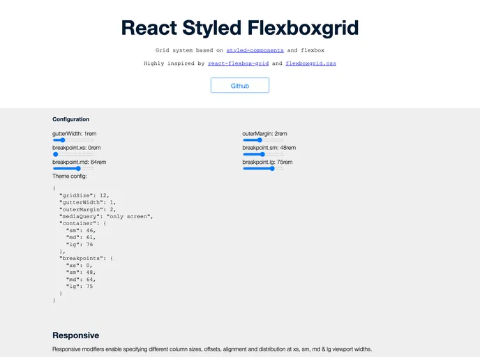
Customizable Grid Configuration: Easily modify properties like gutter width using the
<ThemeProvider>component from styled-components, ensuring that your grid meets specific design requirements.Fluid and Fixed Containers: The
<Grid>component can be set to create either a responsive fixed-width container or a full-width container that spans the entire viewport, providing versatility in layout design.Flex Direction Control: Control the layout direction of rows and columns using props like
reverse, allowing for complex arrangements like row-reverse or column-reverse.Responsive Breakpoints: Customize visibility and size of columns based on breakpoints (xs, sm, md, lg), giving you full control over your layout’s presentation on different devices.
Alignment Options: Flexibly align items within the grid using simple string props (start, center, end, top, middle, bottom) to achieve the desired positioning across your rows and columns.
Peer Dependencies: Built on top of widely used libraries, it requires minimal setup with react, prop-types, and styled-components, ensuring compatibility and easy integration into your project.
Integration with Emotion: For those using Emotion for styling, simply import from
react-styled-flexboxgrid/emotionto leverage the benefits of both libraries seamlessly.Open Source: Licensed under MIT, it offers freedom and flexibility for developers to use, modify, and distribute as needed within their projects.


