


 Github Stars:
 Last Commit:
  Created: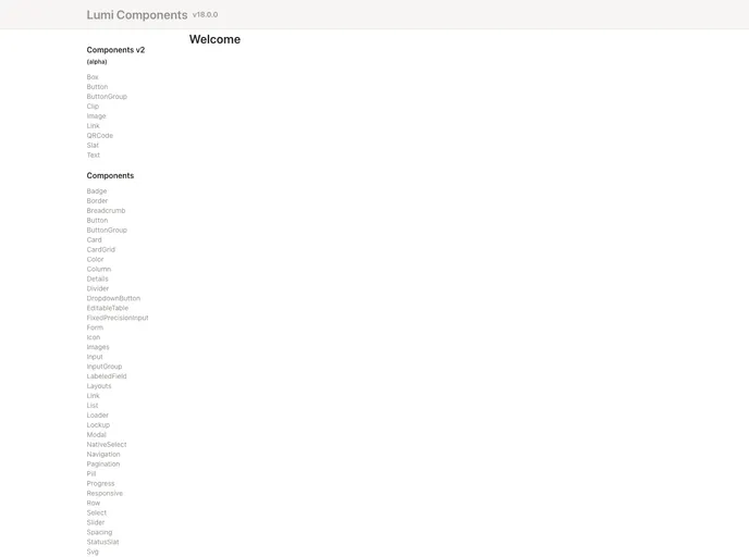
Overview
The purescript-lumi-components is a component library specifically designed for Lumi’s UI and UX needs. It includes a set of components that can be readily used in Lumi’s applications. This library aims to provide a consistent and efficient development experience for Lumi’s designers and developers.
Features
- Component-focused: The library focuses on providing a wide range of components tailored to Lumi’s specific UI and UX requirements.
- Easy CSS integration: To utilize the styles that come with these components, the CSS needs to be injected into the page. This can be done by running the
attachGlobalComponentStyleseffect provided byLumi.Components.Stylesduring application initialization. - Local development support: The library includes support for local development and enables running production builds that output minified, static files into the
build/directory using thenpm run buildcommand.
Installation
To install the purescript-lumi-components library, follow these steps:
- Make sure you have the necessary npm dependencies installed. These dependencies and their versions must be compatible with the ones listed in the library.
- Run the
attachGlobalComponentStyleseffect available inLumi.Components.Stylesduring your application initialization to inject the required CSS styles.
Summary
The purescript-lumi-components library is a highly specialized component library tailored specifically for Lumi’s UI and UX needs. With its focus on providing a wide range of components and easy integration of CSS styles, it aims to streamline the development process for Lumi’s designers and developers.


