 Github Stars:
 Last Commit:
  Created:
Overview
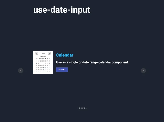
The use-date-input is a versatile React library that allows developers to effortlessly create custom date picker and calendar UI components. With its intuitive design, you can set up a fully functional date picker in just minutes, making it an ideal solution for both simple and complex applications. This library aims to empower developers by providing significant control over the look and functionality of date-related components.
One of the standout aspects of this library is its commitment to accessibility and flexibility. It caters to various date frameworks and can easily adapt to your specific needs, whether you’re building a straightforward date input or a more elaborate calendar interface. The attention to detail and focus on usability truly set this library apart as a powerful tool for any React developer.
Features
- Lightweight: Optimized bundle size ensures quick loading times and performance in your application.
- Control: Built with React hooks and the reducer pattern, granting you full control over the component’s state.
- Themeable: The naked UI component design features a simple theming API to easily customize styles.
- Date Frameworks: Compatible with various date frameworks such as dayjs, date-fns, luxon, and moment, allowing for flexible integration.
- Composable: Can be combined with any UI framework to create custom date inputs, dialogs, or calendars.
- Accessible: Designed with accessibility in mind, featuring full keyboard and screen-reader support for an inclusive user experience.
- Localization: Easily customize regions and labels to meet the needs of different audiences.
- Documentation: Comprehensive documentation includes editable examples to help you get started quickly.


