 Github Stars:
 Last Commit:
  Created:
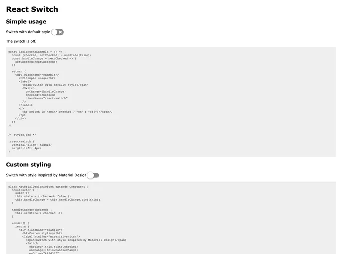
Overview
The draggable toggle-switch component for React is an innovative and flexible tool designed to enhance user interaction in web applications. Its ability to be controlled via mouse or touch makes it an ideal choice for both desktop and mobile environments. This component not only prioritizes functionality but also accessibility, ensuring that all users, including those with visual impairments, can interact with it effectively.
With its lightweight package size and sensible default styling, this toggle switch offers a seamless integration into your existing projects, making it a valuable addition to any developer’s toolkit.
Features
- Draggable Flexibility: Users can toggle the switch using either a mouse or touch, catering to various interaction preferences.
- Customizable Design: Easily adjust the size, color, and other visual aspects to fit the aesthetic of your application.
- Accessibility Focused: Designed for inclusivity, it supports screen readers and allows text clicking to toggle, making it user-friendly for visually impaired individuals.
- Compact Package Size: With a gzipped size of less than 2.5 kB, it is lightweight and won’t bloat your application’s performance.
- Sensible Default Styling: Inline styles are provided so there’s no need for a separate CSS import, allowing for a quick and easy setup.
- Smooth Interaction: The switch is equipped with a robust
onChangefunction that interacts seamlessly with user actions, providing real-time feedback. - Configurable States: The component includes properties for checked and disabled states, ensuring precise control over user interactions.


