 Github Stars:
 Last Commit:
  Created:
Overview
Smores React is a collection of React components that adhere to Marshmallow’s Design System - “S’mores”.
Features
- Collection of React components
- Adheres to Marshmallow’s Design System - “S’mores”
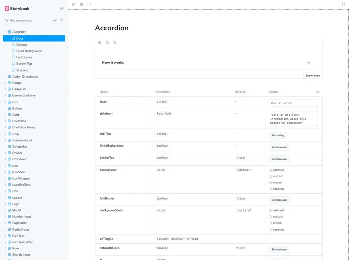
- Components include Accordion, ActionDropdown, Box, Button, Card, CheckBox, CheckBoxGroup, Datepicker, Dropdown, Emoji, Icon, IconWrapper, LabelledText, Loader, Message (deprecated - use Support Message instead), Modal, NumberInput, RadioButton, Row, SearchInput, SupportMessage, Tag, Text, Textarea, TextInput, and Toggle.
Installation
Before starting, ensure that CHANGELOG.md is updated according to Keep a Changelog with the latest release notes. If not, make a pull request updating it before continuing.
- Checkout a new branch from the main branch.
- Update the Changelog and bump the project version according to semver.org.
- Create a pull request.
- Once merged, go to the main branch, pull, and push the new tag to origin.
- Wait for the build to be successful in GitHub Actions workflow.
- Login and publish to NPM.
Running Smores in dev mode: To run Smores in dev mode, follow the below instructions on installing and using Yalc to link up your project repo with Smores.
Install yalc on a global level by running:
npm install -g yalcThis only needs to be installed once.
Make desired changes in the Smores repo.
On your Smores branch, run:
npm run buildThis will copy all the files that should be published into a remote NPM registry.
In your project repo (not Smores), run:
yalc add @mrshmllw/smores-reactThis will copy the current version from the store to your project’s .yalc folder and inject a file: .yalc/@mrshmllw/smores-react dependency into package.json.
Every time you make changes in Smores and you want to see it locally, run:
npm run build
yalc publish
In your project folder, run the following to see the changes:
yalc link @mrshmllw/smores-reactWhen you have finished development, run the following in your project folder to remove all linked packages:
yalc remove @mrshmllw/smores-react
Summary
Smores React is a collection of React components that adhere to Marshmallow’s Design System. It provides a range of components including Accordion, Button, Card, Checkbox, Datepicker, Dropdown, Emoji, Icon, Loader, Modal, RadioButton, SearchInput, Tag, Text, Textarea, Toggle, and more. It also provides a guide on how to install and use these components in development mode.


