 Github Stars:
 Last Commit:
  Created:
Overview
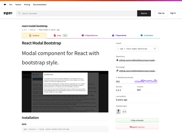
If you’re looking to incorporate a modal into your React application while maintaining a cohesive look with Bootstrap styles, the React Modal Bootstrap component is a stellar choice. Designed to seamlessly integrate with React, it provides a user-friendly interface and a variety of customizable options that can enhance user engagement on your website or application.
This component comes equipped with essential features that allow for a versatile modal experience, making it suitable for various use cases, from simple alerts to complex form submissions. Below, we’ll explore some of its standout features that make it a go-to solution for developers.
Features
- Easy Installation: Easily install the component using popular package managers like NPM and Bower, ensuring quick setup within your React project.
- Customizable Styles: Tailor the look of your modal using
backDropStylesanddialogStylesprops, creating a unique appearance that fits your aesthetic. - Multiple Sizes: Choose from different modal sizes to suit your content requirements, including options like ‘modal-lg’ and ‘modal-sm’.
- Backdrop Click to Close: The
backdropprop allows the modal to close when the backdrop is clicked, enhancing the user experience by providing an intuitive way to dismiss the modal. - Keyboard Accessibility: With the
keyboardprop, users can close the modal by pressing the ESC key, making it more accessible for keyboard users. - Callback Feature: Utilize the
onRequestHidefunction to execute actions when the modal requests to be hidden, allowing for more dynamic interactions. - Default and Custom Styles: Choose between default styles or customize with your own to ensure the modal blends seamlessly with your overall design.


