 Github Stars:
 Last Commit:
  Created:
Overview
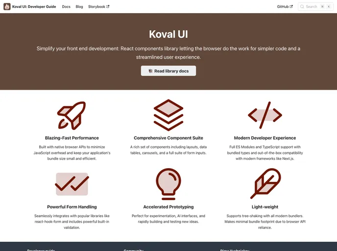
Koval UI is a modern React component library that blends experimentation with performance. Designed specifically for developers looking to create cutting-edge applications or rapidly prototype new ideas, Koval UI offers a robust suite of components while minimizing JavaScript overhead. With native browser APIs at its core, this library not only enhances performance but also significantly reduces bundle size, making it a compelling choice for contemporary web development.
Koval UI encompasses a wide array of components essential for building user interfaces, such as layout systems, various input types, form functionalities, data tables, and carousels. Whether you’re working on advanced AI interfaces or swift project prototypes, Koval UI is equipped to help you accelerate your development process.
Features
- Typescript Support: Fully supports bundled types for seamless integration with Typescript projects.
- Flexible Bundle Options: Offers both ESM and CommonJS bundles to cater to different module systems.
- Next.js Compatibility: Easily integrates with Next.js, enhancing server-side rendering options for React applications.
- Responsive Layout: Utilizes a CSS Flex column-based layout for flexible and responsive design.
- Input Compatibility: Inputs are designed to work seamlessly with react-hook-form and similar libraries for effortless form handling.
- Built-in Form Validation: Streamlines form processes with inherent validation capabilities.
- Typography Components: Provides various typography components for consistent and visually appealing text presentation.
Explore Koval UI to take your project to the next level!


