## Overview
The React Responsive Modal is an essential component for any React application that requires a user-friendly modal interface. Designed to be responsive, it allows developers to create modals that function seamlessly across different devices and screen sizes. This library enhances the user experience by ensuring that the modals are not only stylish but also highly functional.

With a focus on ease of use and customization, the React Responsive Modal empowers developers to implement modals that fit the aesthetics and functionality requirements of their projects without much hassle. Whether it's for form submissions, confirmation dialogs, or informational pop-ups, this component stands out as a reliable solution.

## Features
- **Responsive Design**: Automatically adapts to different screen sizes, ensuring a consistent experience on mobile, tablet, and desktop devices.
- **Easy to Customize**: Offers a variety of props to easily modify the modal's appearance and behavior to suit your application’s style.
- **Keyboard Accessibility**: Supports keyboard navigation, making it easier for users to interact with the modal through keyboard shortcuts.
- **Animation Options**: Includes smooth transition animations for opening and closing the modal, contributing to a refined user experience.
- **Close on Overlay Click**: Users can dismiss the modal by clicking outside of it, providing a straightforward way to exit the modal without needing additional buttons.
- **Multiple Instances**: Allows multiple modal instances to be opened simultaneously, useful for applications requiring several modals at once.
- **Flexible Content**: Supports rendering various types of content including text, forms, images, and even other components, making it versatile for different use cases.
 Github Stars:
 Last Commit:
  Created:
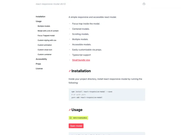


