 Github Stars:
 Last Commit:
  Created:
Overview
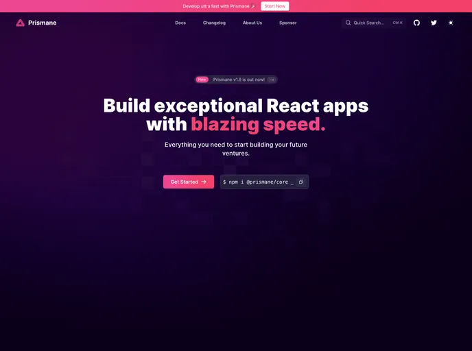
This product is a theme package that offers custom styling system and dynamic theming options. It includes a wide range of React components and custom hooks, as well as form validators. The theme package is highly customizable and supports both dark and light theme variants. The product aims to simplify the development process and enhance user experience.
Features
- Custom styling system: The theme package provides a custom styling system that allows users to easily customize the appearance and style of the components.
- Dynamic theming out of the box: The product offers built-in support for dynamic theming, making it easy to switch between dark and light theme variants.
- Wide range of React components: The package includes over 100 React components, providing a comprehensive set of building blocks for developers.
- Custom hooks: With more than 20 custom hooks available, developers can easily add functionality and enhance their applications.
- Custom form validators: The theme package includes 10+ custom form validators, making it easy to validate user input in forms.
Installation
To use this theme package, follow the steps below:
- Install the package using your preferred package manager:
npm install theme-package
- Import the theme package in your project:
import { ThemeProvider } from 'theme-package';
- Wrap your application with the
ThemeProvidercomponent:
<ThemeProvider theme="light">
  // Your application components
</ThemeProvider>
- Customize the theme by updating the theme prop value. You can choose between “light” and “dark”:
<ThemeProvider theme="dark">
  // Your application components
</ThemeProvider>
- Explore the documentation and Storybook for more details on available components and hooks.
Summary
This theme package offers a customizable and dynamic theming solution for React applications. With a wide range of components, custom hooks, and form validators, developers can enhance their projects and achieve a consistent and user-friendly design. The package is easy to install and use, with extensive documentation and a Storybook for reference.


