 Github Stars:
 Last Commit:
  Created:
Overview
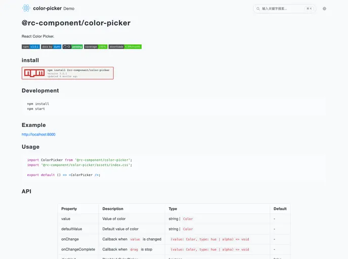
The React Color Picker is a versatile tool designed for seamless integration into React applications. As a powerful component, it allows users to easily select and manipulate colors, catering to developers who require flexibility and a robust user interface. With its customizable features and the ability to convert between color formats, it serves as an essential addition for anyone looking to enhance user interactions with color selections in their projects.
Features
- Value Management: The Color Picker allows you to set and manage color values through its
valueanddefaultValueproperties, ensuring easy state management. - Change Callbacks: With
onChangeandonChangeComplete, you receive real-time updates when users interact with the color picker, allowing dynamic responses based on user input. - Accessibility Options: The
disabledproperty lets you easily disable the Color Picker, which is beneficial for scenarios where color selection should be limited or restricted. - Custom Panel Rendering: Using the
panelRenderproperty, you can provide custom rendering for the color palette, accommodating unique design requirements. - Alpha Slider Control: The
disabledAlphaoption allows you to enable or disable the alpha slider, providing further customization over how colors are selected and displayed. - Conversion Functions: The component includes various methods for color format conversion, such as
toHexStringfor hex,toRgbfor RGB, andtoHsbfor HSB, facilitating flexibility in how colors are handled programmatically.


