 Github Stars:
 Last Commit:
  Created:
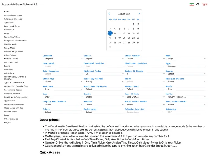
Overview
The DatePickerSimple is a versatile React datepicker component that brings a wealth of scheduling options to your web applications. Designed to seamlessly work with various calendar systems, including Gregorian, Persian, Arabic, and Indian calendars, it provides users a flexible way to select dates in several modes: from single and multiple selections to date ranges and multiple ranges. This adaptability makes it an excellent choice for international applications or users who follow different calendar systems.
Beyond its rich calendar functionalities, the DatePickerSimple also allows for customization of layouts and appearances, making it suitable for both standard and mobile interfaces. It enhances user experience by offering not only aesthetic options but also multiple plugins to extend its capabilities further, ensuring that developers can tailor the datepicker to fit their specific needs.
Features
Multiple Calendar Support: Works seamlessly with Gregorian, Persian, Arabic, and Indian calendars, catering to diverse user needs.
Flexible Date Selection Modes: Choose from single, multiple, range, and multiple range date selection modes for versatile calendar interactions.
Customizable Layouts: Easily switch between a prime or mobile appearance by importing the appropriate CSS files from the styles folder.
Plugin Compatibility: Extend functionality by integrating several plugins to enhance features and user experience.
Custom Calendar and Locale Creation: Create specialized calendar formats and localize names for months and weekdays using props for tailored experiences.
Wide Range of Picker Options: Includes multiple date pickers, time pickers, and a full year picker to accommodate various date and time selection needs.
User-Friendly Installation: Easy setup process with straightforward instructions for integration into your project.
Dynamic Appearance Adjustments: Customize both the calendar and input display, allowing for adaptation to suit different user interfaces or preferences.


