 Github Stars:
 Last Commit:
  Created:
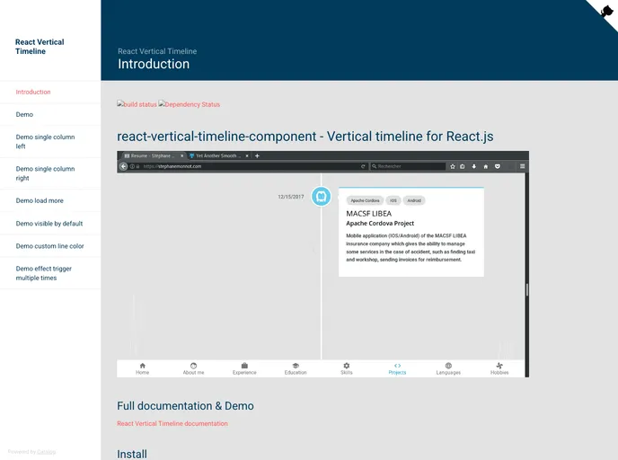
Overview
The react-vertical-timeline-component is a powerful tool for developers who need to create visually engaging timelines in their React applications. With its flexible design and rich set of features, users can craft unique experiences that effectively convey information in a chronological format. Whether you’re showcasing your resume, project milestones, or event sequences, this component provides the necessary tools to implement a polished timeline with ease.
One of the standout aspects of this component is its customization capabilities. From animations to layout options, users have the freedom to tailor the timeline to match their specific needs and design aesthetics. This ensures that developers can create engaging narratives that are not only functional but also visually appealing.
Features
- Animations: Enable or disable animations on elements to enhance user interaction, with the default setting set to true.
- Custom Layouts: Choose between ‘1-column-left’, ‘1-column-right’, or ‘2-columns’ to suit the design of your application, defaulting to two columns.
- Timeline Color: Customize the timeline line color to fit your project’s overall color scheme, with a default color of white.
- Element Positioning: Easily position timeline elements to the left or right for a better visual impact.
- Content Styling: Add custom styles for the content and arrows, making it easier to achieve the desired look and feel.
- Icon Flexibility: Select icons for each timeline element and customize their size and style to enhance visual representation.
- Date Handling: Assign specific dates to each timeline element, allowing for chronological storytelling.
- Visibility Control: Control whether elements should be visible by default when initially outside the viewport, enabling better user interactions.


