 Github Stars:
 Last Commit:
  Created:
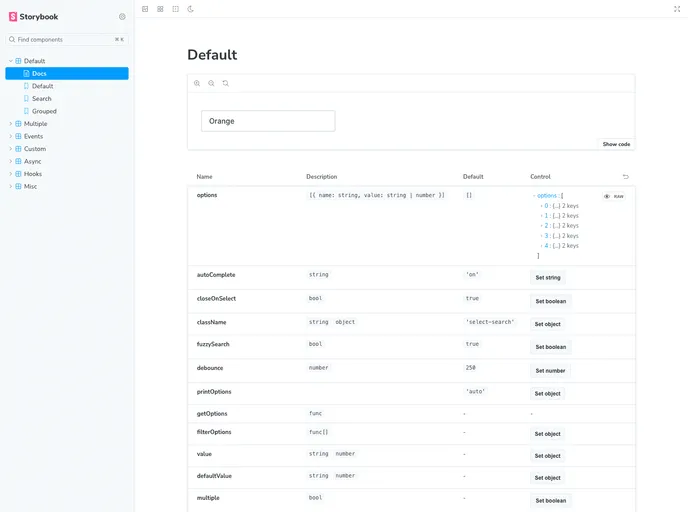
Overview
If you’re on the lookout for a versatile and lightweight select component for your project, you might want to consider this zero-dependency option. Originally developed as an open-source project, it has garnered attention for its speed and simplicity. With a firm commitment to accessibility and customizable features, this component stands out as a practical choice, especially for developers who prioritize clean, efficient code without the bloat of unnecessary libraries.
The journey of this select component has been a collaborative effort, with numerous contributors helping shape its functionality. As the creator transitions away from the project, the call for new maintainers highlights the importance of community-driven development. This project’s focus on performance, ease of use, and a headless approach provides an excellent foundation for building elegant user interfaces.
Features
- Lightweight: With zero dependencies, this component ensures a small footprint and faster loading times.
- Accessible: Designed with accessibility in mind, it aims to be usable by everyone, including those who rely on assistive technologies.
- Headless Mode: Offers the flexibility to build personalized user experiences, allowing developers to control markup and behavior through hooks.
- Basic HTML Select Functionality: Includes support for standard HTML select features, along with multiple selections for a broader range of use cases.
- Search/Filter Options: Empowers users to easily locate their desired options with integrated search functionality.
- Async Options: Supports asynchronous data fetching to dynamically populate the select menu, making it adaptable for larger datasets.
- Fully Stylable: Customize the appearance of the component to match your application’s design without hassle.
- Keyboard Support: Ensures that navigation can be performed seamlessly through keyboard shortcuts, enhancing user experience.


