 Github Stars:
 Last Commit:
  Created:
Overview
The Motion library has taken bottom sheet components to the next level with its innovative Sheet component. Built with usability and customization in mind, this component allows for an extensive range of customization, ensuring that it seamlessly integrates into your application. Whether you are a seasoned developer or just starting, this component aims to provide the tools needed to create an intuitive and engaging user experience with minimal effort.
With a focus on flexibility, the Sheet component follows the Compound Component pattern. This means you can easily piece together your bottom sheet from various subcomponents. Not only does this approach enhance the design possibilities, but it also makes implementing accessibility features straightforward, thereby ensuring that your application is user-friendly for all.
Features
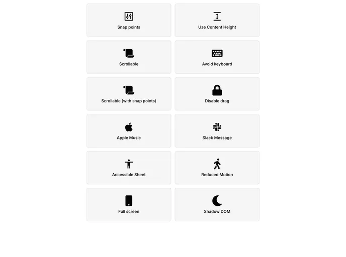
Flexible Composition: Easily create your bottom sheet by utilizing smaller building blocks, such as Container, Content, Scroller, Header, and Backdrop, allowing for a highly customizable output.
Enhanced Control: You have the freedom to skip rendering components like the backdrop, providing complete control over your bottom sheet’s appearance without complicated prop adjustments.
Accessibility Focus: By separating components, you can assign accessibility attributes to each piece, ensuring compliance without overloading the main sheet component.
Seamless Integration: Designed to work smoothly with the Motion library, ensure your components transition and animate beautifully.
Event Handling: The
onCloseprop allows you to easily manage user interactions, triggering actions seamlessly when the sheet is closed.Open State Management: With the
isOpenprop, you can easily control the visibility of the sheet, helping to enhance user engagement in your application.Customizable Child Components: Use the
childrenprop to compose your bottom sheet with specific subcomponents tailored to your needs, providing unparalleled flexibility.


