 Github Stars:
 Last Commit:
  Created:
Overview
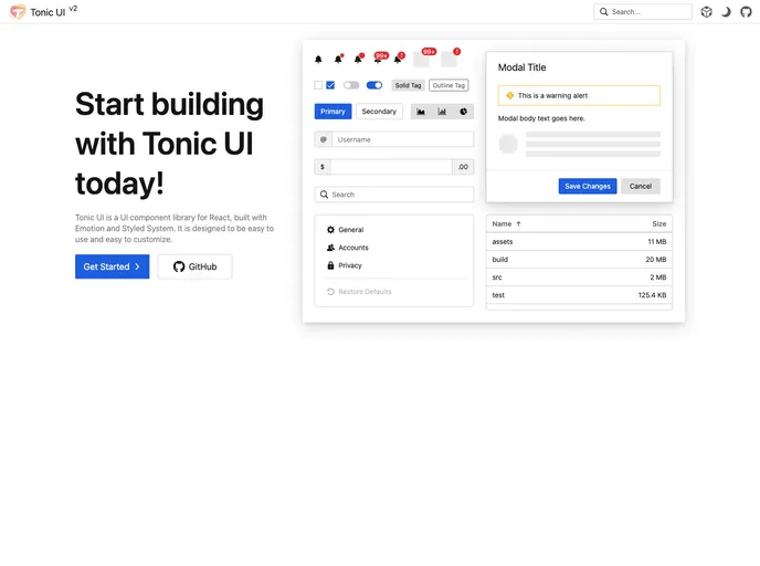
Tonic UI is a UI component library for React, built with Emotion and Styled System. It aims to provide an easy-to-use and customizable solution for building user interfaces.
Features
- Unified color theme provider: Tonic UI offers a color theme provider that allows switching between dark and light modes effortlessly.
- Easy customization: The library provides building block components that make it simple to customize UI components according to specific needs.
- Standardized styled system and theme: Tonic UI utilizes a standardized styled system and theme to ensure consistency and ease of development.
Installation
To install Tonic UI, follow these steps:
Open your terminal.
Run the following command to install the library and its dependencies:
npm install tonic-uiImport the desired components from Tonic UI into your React project:
import { Button, Input } from 'tonic-ui';Start using the components in your application.
Summary
Tonic UI is a React component library that offers an easy-to-use solution for building user interfaces. With features like a unified color theme provider, easy customization options, and a standardized styled system and theme, developers can create appealing and cohesive UIs. The library can be installed using npm and integrated into React projects seamlessly.


