 Github Stars:
 Last Commit:
  Created:
Overview
The Garden design system by Zendesk has brought a refreshing approach to building interfaces with its React components. This library not only ensures a cohesive look and feel across applications but also enhances the developer experience by providing a well-structured suite of components. Each component can be installed individually, promoting flexibility and efficiency for developers who want to keep their projects lightweight while still using high-quality elements.
Garden React Components stand out with their commitment to consistency and ease of use. By maintaining a multi-package approach, they allow developers to cherry-pick the components that best suit their needs without unnecessary bloat. Below is a closer look at some of the key features that make Garden React a desirable choice for web application development.
Features
- Consistent Styling: Each component follows a unified design language, ensuring visual harmony across your project.
- Multi-Package Approach: Components are individually packaged and published, giving developers the flexibility to install only what they need.
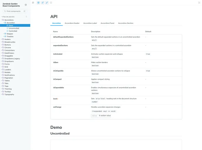
- Broad Component Library: A vast selection of UI components, including accordions, buttons, and dropdowns, streamlining the development process.
- Installation Simplicity: Each component comes with its own README file, making the installation process straightforward for developers.
- Performance Optimized: Each component’s bundle size is minimized, contributing to faster loading times and a better user experience.
- Comprehensive Documentation: Features detailed documentation that assists developers in understanding and implementing each component effectively.
- Theming Support: Easily customizable themes allow for adaptation to suit any branding or design requirement.
- Responsive Design: Components are built with responsiveness in mind, ensuring they work seamlessly across different screen sizes.


