 Github Stars:
 Last Commit:
  Created:
Overview:
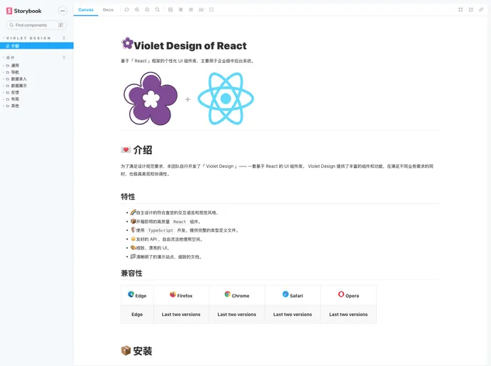
The article discusses the introduction, features, compatibility, installation, and usage of the Violet Design, a UI component library based on React. It emphasizes the intuitive design, high-quality components, use of TypeScript, friendly API, beautiful UI, and clear documentation provided by Violet Design. The article also mentions the compatibility of Violet Design with different browsers.
Features:
- Intuitive and visually appealing design: Violet Design offers a self-designed, intuitive interaction language and visual style.
- Ready-to-use React components: The library provides high-quality React components that are ready to be used.
- TypeScript support: Violet Design is developed using TypeScript and provides complete type definition files.
- Flexible API: The library offers a friendly API that allows for flexible usage and customization.
- Beautiful UI: Violet Design aims to provide detailed and beautiful user interface elements.
- Clear documentation: The library includes a clear and comprehensive demonstration site and detailed documentation.
Installation:
To install Violet Design, there are two options:
Using npm:
$ npm install violet-designUsing yarn:
$ yarn add violet-design
Summary:
The article introduces Violet Design, a UI component library based on React. It highlights the intuitive design, high-quality components, TypeScript support, flexible API, beautiful UI, and clear documentation provided by Violet Design. The article also mentions the compatibility of Violet Design with different browsers. Overall, Violet Design is presented as a comprehensive and visually appealing solution for designing and implementing UI components in React applications.


